Embedding Heatmaps in LaTeX Tables
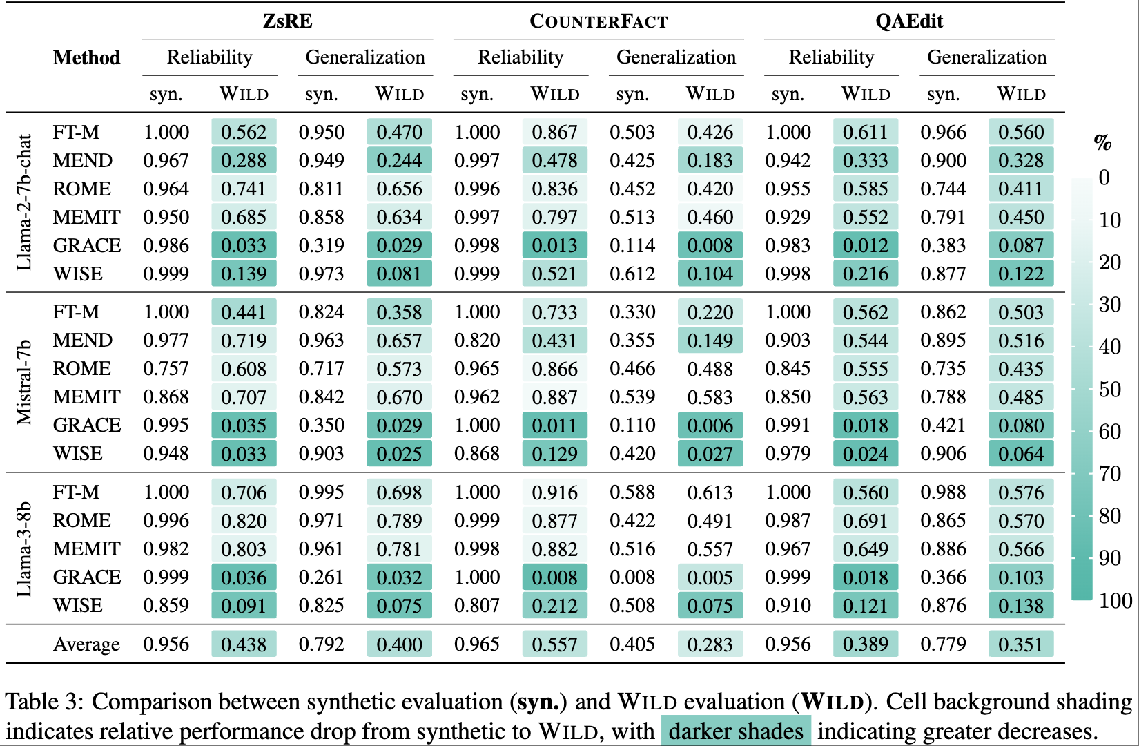
In our ACL 2025 paper The Mirage of Model Editing: Revisiting Evaluation in the Wild, we needed a compact yet expressive way to present the performance degradation of model editing methods when moving from synthetic to real-world (Wild) evaluation settings.
The most natural way to highlight these performance drops is through a heatmap, where deeper colors indicate larger decreases. However, manually adding background colors to each table cell in LaTeX and calculating appropriate color gradients would be extremely tedious and error-prone.
To address this, we designed a LaTeX table that automatically applies heatmap-style background coloring to each cell based on the relative performance drop, using TikZ to dynamically compute and render the shading intensity. This approach provides a clear visual signal for how robust—or brittle—editing methods are under realistic evaluation.
Here’s what the final result looks like:

Implementation
heatmap
\numwild{<wild_value>}{<synthetic_value>}
This is the core macro. It compares the WILD score with the corresponding synthetic score and calculates the percentage drop. Then, it dynamically fills the background color intensity using TikZ.
\newcommand{\numwild}[2]{
    \begin{tikzpicture}[baseline]
        \pgfmathparse{#1 > #2 ? 1 : 0}
        \ifnum\pgfmathresult=0
            \pgfmathsetmacro{\percentdiff}{min(130, 130*(#2-#1)/#2)}
            \pgfmathsetmacro{\intensity}{\percentdiff}
            \fill[monte_carlo!\intensity!white, rounded corners=1] (-0.6em, -0.3em) rectangle (2.6em, 1em);
        \fi
        \node[inner sep=0pt] at (1em, 0.7ex) {#1};
    \end{tikzpicture}
}
How It Works
-
Input Parameters: The command takes two arguments - the Wild evaluation score (
#1) and the synthetic evaluation score (#2). -
Conditional Coloring: It only applies coloring when the Wild score is lower than the synthetic score (indicating a performance drop).
- Color Intensity Calculation: The intensity is calculated as a percentage of the performance drop, capped at 130% to ensure visibility:
\pgfmathsetmacro{\percentdiff}{min(130, 130*(#2-#1)/#2)} - Background Rendering: A filled rectangle with rounded corners is drawn behind the text:
\fill[monte_carlo!\intensity!white, rounded corners=1] (-0.6em, -0.3em) rectangle (2.6em, 1em);- Color mixing:
monte_carlo!\intensity!whitecreates a blend between themonte_carlocolor and white, where\intensity(0-130) controls the mixing ratio - Rectangle coordinates:
- Bottom-left corner:
(-0.6em, -0.3em)- starts 0.6em to the left and 0.3em below the baseline - Top-right corner:
(2.6em, 1em)- extends 2.6em to the right and 1em above the baseline - This creates a rectangle that’s 3.2em wide and 1.3em tall, providing adequate padding around the number
- Bottom-left corner:
- Color mixing:
- Text Display: The Wild evaluation value is positioned at the center of the colored background:
\node[inner sep=0pt] at (1em, 0.7ex) {#1};- Position:
(1em, 0.7ex)places the text 1em from the left (roughly centered in the 3.2em wide rectangle) and 0.7ex above the baseline -
inner sep=0pt: Removes default padding around the node to ensure precise positioning - The
exunit (x-height) is used for vertical positioning to maintain proper alignment with surrounding text
- Position:
Note: These coordinates work well for our specific use case, but you may need to adjust them.
Color Bar Implementation
To help readers interpret the heatmap, we include a vertical color bar:
\newcommand{\colorbarvertical}{
    \begin{tikzpicture}
        % Create smooth vertical gradient
        \shade[top color=white,
               bottom color=monte_carlo!150,
               rounded corners=0.6] (0, 0) rectangle (0.3, 6);
        % Add scale markers
        \foreach \y in {0,0.1,...,1} {
            \pgfmathsetmacro{\percentage}{\y*100}
            \draw[white, semithick] (0.25, 6-\y*6) -- (0.3, 6-\y*6);
            \draw[white, semithick] (0, 6-\y*6) -- (0.05, 6-\y*6);
            \node[right] at (0.25, 6-\y*6)
                  {\footnotesize \pgfmathprintnumber[fixed,precision=0]{\percentage}};
        }
        \node[right] at (0.25, 0) {\footnotesize \pgfmathprintnumber[fixed,precision=0]{100}};
        \node[right] at (0.15, 6.5) {\small \textbf{\%}};
        \node[right] at (0.15, 7.7) {};
    \end{tikzpicture}
}
How It Works
- Gradient Background:
\shade[top color=white, bottom color=monte_carlo!150, rounded corners=0.6] (0, 0) rectangle (0.3, 6);- Creates a rectangle from (0,0) to (0.3, 6) - that’s 0.3 units wide and 6 units tall
-
\shadeproduces a smooth gradient from white at the top to 150% intensity monte_carlo at the bottom - The
!150creates an over-saturated color for better visual impact - Rounded corners add a polished look
- Scale Markers:
\draw[white, semithick](0.25, 6-\y*6) -- (0.3, 6-\y*6); \draw[white, semithick] (0, 6-\y*6) -- (0.05, 6-\y*6);- Creates clean straight lines on the left side of the color bar
- Percentage Labels:
\node[right] at (0.25, 6-\y*6) {\footnotesize \pgfmathprintnumber[fixed,precision=0]{\percentage}};- Places percentage values to the right of the color bar
-
\pgfmathprintnumber[fixed,precision=0]formats numbers without decimal places - The manual “100” at the bottom avoids potential floating-point issues.
Usage in Tables
Using this approach in your tables is straightforward. Here’s a minimal example of how to use this in a table:
\begin{table}
\begin{minipage}{0.94\textwidth}
\begin{tabular}{l cc cc}
\toprule
Method & \multicolumn{2}{c}{Reliability} & \multicolumn{2}{c}{Generalization} \\
       & syn. & \textsc{Wild} & syn. & \textsc{Wild} \\
\cmidrule(lr){2-3} \cmidrule(lr){4-5}
FT-M   & 1.000 & \numwild{0.562}{1.000} & 0.950 & \numwild{0.470}{0.950} \\
MEND   & 0.967 & \numwild{0.288}{0.967} & 0.949 & \numwild{0.244}{0.949} \\
ROME   & 0.964 & \numwild{0.741}{0.964} & 0.811 & \numwild{0.656}{0.811} \\
\bottomrule
\end{tabular}
\end{minipage}
\end{minipage}
\hfil
\begin{minipage}{0.05\textwidth}
\colorbarvertical
\end{minipage}
\caption{Performance comparison with automatic heatmap coloring}
\end{table}
Benefits
- Automatic Calculation: No need to manually calculate color intensities for each cell
- Consistent Visualization: Ensures uniform color mapping across all cells
- Easy Maintenance: Changing values automatically updates the visualization
- Customizable: Easy to adjust color schemes, intensity calculations, or cell styling
Enjoy Reading This Article?
Here are some more articles you might like to read next: